Every people has their own experienced surfing various types of document design where is from dull and ill document design to an attractive and good designs. After I have done my readings regarding document design and the principles and techniques, I can conclude that, several elements are significant in designing a good document design. I believed that, using high standard of writing, proper sub-headings as well as adding suitable images will help to hold the reader's attention while reading.
Walsh (2006, p.26) says that, written text is only one part of the message and no longer the dominant part. This means, besides written text as a vital factor of good design, images is gaining importance over written text.
According to Schriver, the first principles need to consider before beginning a document is to identify the possible target audience for the text. Document design is meant to 'help people to achieve their specific goals for using texts at home, school or work ( Schriver, 1997). This means, as a document designers, they have to be responsible in order to ensure their readers keep reading until the end and will get proper and crystal clear of information or instructions.
In addition, document designers are advised to apply multiple of diversity of elements when producing a document. They have to know that not everything can be realized in language, but can also be realized by means of images (Kress & van Leeuwen, 2006,pg 19).
My group presentation's slides are applied the recommendations as suggested in the readings concerning a good document design. For instance, take a look at this slide:

In this slide, we created proper document design elements such as the used of proper font types and size as well as colours. For this introduction slide, we choose black and bolded, different font types for the main title and sub-title in order to capture reader's understanding. According to MacKenzie as quoted in Putnis& Petelin (1996,pg241), optimum legibility is fundamental for designing a good document. It involves elements such as the type and size of the font used.
Reep (2006) states that headings call the reader's attention to the specific topics, and divide the major points to achieve better understanding in one document.

In this slide, our group used appropriate headings to highlight the important points as well as to capture reader's interest to read more about the topic. The title is bolded and place on top of the page and the font is in larger size than the bullet points under the heading.
Moreover, Reep also argues that the use of same kind of font and avoid using all capitals are elements of good design. Reep and Nielsen agree that listing out factors and sub-topics is to underline information and simplify the complex facts for the readers.
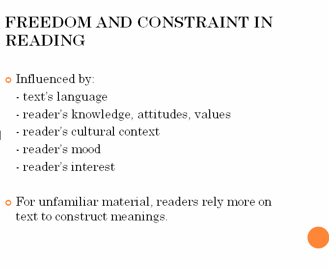
Nielsen (1997) says that bulleted lists and separate idea for each paragrapgh would help the readers along the reading journey. For instance, take a look at this slide,
Moreover, Reep also argues that the use of same kind of font and avoid using all capitals are elements of good design. Reep and Nielsen agree that listing out factors and sub-topics is to underline information and simplify the complex facts for the readers.
Nielsen (1997) says that bulleted lists and separate idea for each paragrapgh would help the readers along the reading journey. For instance, take a look at this slide,

References
Kress, G. & van Leeuwen, T.2006, Reading images, Chapter 1: The semiotic landscape: language and visual communication.
Nielsen, J.1997, How Users Read on the Web, viewed 4 April 2010, www.useit.com/alertbox/9710a.html
Putnis, P,Petelin, R 1996, 'Writing to communicate' in Professional Communication: Principles and Applications, Prentice Hall, Sydney.
Reep, D.C 2006, 'Chp 4: Principles of Document Design', in Technical Writing,6th ed, PearsonEdu,Inc.,New York, p.173-190.
Schriver, K.A. 1997, Chapter 6: Dynamics in document design: creating texts for readers, Wiley Computer Pub., New York.
Walsh, M.2006, " 'Textual Shift': Examining the reading process with print, visual and multimodal texts", Australian Journal of Language and Literacy, vol.29, no.1, p.24-37.

0 comments:
Post a Comment